The Super Admin Tools in Coursebox's Branded Platform empower organizations to fully customize and manage their learning environment. As a Super Admin, you have comprehensive control over branding, user management, course settings, and integrations, ensuring a seamless and tailored experience for your learners.
Key capabilities include:
- Full Branding Control: Customize your platform with your organization's logo, colors, and domain, removing all Coursebox branding.
- Advanced User Management: Manage user roles and permissions, and oversee up to 10,000 active monthly learners.
- Custom Onboarding and Registration: Design personalized onboarding experiences and registration flows for your users.
- Marketplace and Commission Management: Set up and manage your course marketplace, including commission structures.
- LMS Integrations: Integrate with existing Learning Management Systems (LMS) using LTI 1.3 standards.
For Business & Enterprise Accounts only. To upgrade your account go to: https://www.coursebox.ai/pricingManage the Dashboard
This section explains how Super Administrators can access and configure the overall portal settings in Coursebox. From branding and domain setup to system preferences and user permissions, Super Admins have full control to tailor the platform to meet their organisation’s needs.
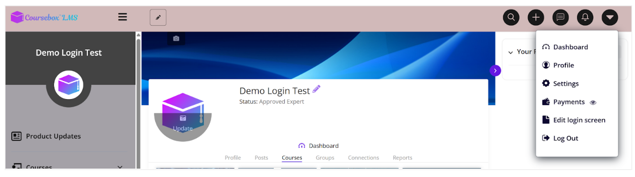
On the course main page, select the dropdown arrow on the top right to reveal the menu. Then select settings.
Branding and Portal Name
The following items are for users who have upgraded from a My.coursebox.ai account to become a super admin on a Branded Training Platform, which is a stand-alone database and installation of the Coursebox platform.
Watch the video below, or explore more tutorials in our Demonstration Video Library.
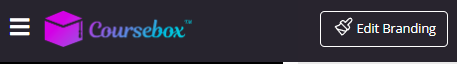
In your course home page click the Edit Branding button at the top left to get started.
Right away you will see a selection of elements that you can modify
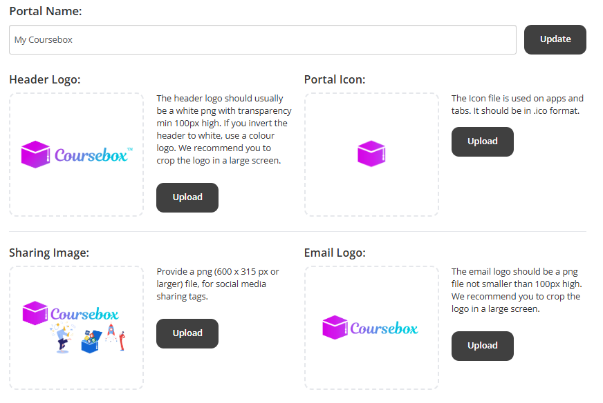
- Portal name: Enter the desired name for your portal. This will be used in all the communication Groups like emails, notifications, browsers etc.
- Header Logo: The header logo should usually be a white png with transparency min 100px high. If you invert the header to white, use a colour logo. We recommend you to crop the logo in a large screen.
- Portal Icon: The Portal Icon file is used on apps and tabs. It should be in .ico format.
- Sharing Image: For the sharing image, provide an image file which will appear as a thumbnail while sharing on social networking sites like Facebook, Twitter and LinkedIn.
- Email Logo: The email logo should be a png file not smaller than 100px high. We recommend you to crop the logo in a large screen.
Using the Top Menu HTML
The Top Menu HTML area lets you add a custom, central header menu for desktop viewers using HTML. This allows you to design navigation links that appear at the top of your site and align with your brand’s look and feel.

Open the Top Menu HTML editor

Switch to HTML mode: Click the
</>button in the toolbar to open the HTML code view.

Add your custom HTML

Use the sample structure below to create your menu:
<div class="top-menu">
  <ul style="list-style:none; display:flex; justify-content:center; gap:30px; margin:0; padding:0;">
    <li><a href="/home" style="text-decoration:none; color:#333; font-weight:bold;">Home</a></li>
    <li><a href="/courses" style="text-decoration:none; color:#333; font-weight:bold;">Courses</a></li>
    <li><a href="/about" style="text-decoration:none; color:#333; font-weight:bold;">About Us</a></li>
    <li><a href="/contact" style="text-decoration:none; color:#333; font-weight:bold;">Contact</a></li>
  </ul>
</div>
- Preview your menu
Save your changes and refresh your page to see the header menu in place.
How do you create the menu HTML? Ask your front end developer to modify this code or contact us for assistance:
https://docs.google.com/document/d/1YG5HHF89Jfbty5KivfsBagnbw_5Laj0Wo36mzSYl2Po/edit?usp=sharing
Example:
If you want a similar menu, please provide as details in the following format. You can see the example below.
Set the Colour Theme
The Course Colours settings allow you to fully customise the visual appearance of your Coursebox platform and individual courses. You can adjust colours to match your brand, improve readability, and create a consistent experience for learners and administrators.
Colour settings are grouped into two levels:
Portal Colours – control the overall look of the Coursebox platform
Course Colours – control how individual courses and course content appear
Tip: Setting colours at the Portal level ensures consistency across all courses and saves time when creating new ones.
You are able to edit the colour scheme across your portal and courses individually in two drop down menus shown below.
Change Colours via Edit Branding
Use this option if you want consistent colours applied across all courses.
Go to Edit Branding.

Select the Colors tab.

Expand Portal Colours or Course Colours.

Click the colour tile or edit icon next to the element you want to change.

Either:
Choose a colour using the picker, or
Enter a HEX code to match your brand exactly.
Repeat for any additional elements.
Changes are applied automatically based on where the colour is set (portal-wide or course-specific).
Portal Colours
Portal Colours define the global branding and navigation experience across the platform.


Branding & Layout
Brand – Primary brand colour used across buttons, highlights, and accents
Body background – Background colour of course content pages
Header background – Background colour of the top header
Header text – Text colour used in the header area
Left Menu Styling
Left menu background – Background colour of the navigation menu
Left menu text – Colour of menu item text
Left menu active text – Text colour of the currently selected menu item
Left menu active item background – Background colour of the selected menu item
Left menu active background – Background colour applied when a menu item is active
Profile & Page Styling
Left menu profile block background – Background colour of the profile section
Left menu profile block text – Text colour within the profile section
Page header text – Colour used for page titles and headers
Couse Colours
Course Colours control the visual appearance of individual courses and learner-facing content. These settings affect how course pages, editors, and SCORM navigation are displayed.


Course Layout & Editor
Course overview main block background
Controls the background colour of the large featured block at the top of the course overview page.Course overview main block text
Sets the colour of the title and description text displayed inside the course overview main block.Course editor band background
Controls the background colour of the top editing toolbar when creating or editing a course.Course editor band text
Sets the colour of text and icons within the course editor toolbar.
Content Styling
Content headings
Controls the colour of all heading styles (H1–H6) used within course lessons.Content links
Sets the colour of clickable links within course content.
SCORM Navigation
SCORM menu item
Controls the text colour of SCORM menu items that are not currently selected.SCORM menu active item
Sets the colour of the currently selected SCORM menu item.SCORM menu background
Controls the background colour of the SCORM navigation menu panel.
Set the Course Fonts
You can define global font settings for your courses by configuring the course font styles. These settings override default HTML styling and apply consistently across all courses.
Note: Font changes do not appear while editing a course page. They are visible in Preview mode and to learners viewing the course.
Choose a Font Family
Select a font family for your course theme using the Font Family dropdown. This font will be applied across headings and body text according to the sizes you set below.

Configure Font Sizes
You can set font sizes for different text levels using the dropdown menus.

Each heading level allows you to select a size (in pixels) from the dropdown to suit your design and readability preferences.
- H1 – Main headings
Used for primary titles such as lesson or page titles. - H2 – Section headings
Used for major sections within a lesson. - H3 – Subsection headings
Used for smaller headings within a section. - P – Paragraph text
Used for all standard body text.
Managing Left-Hand Menu Visibility
As a Super Admin, you can control which items appear in the left-hand navigation menu of your portal. This allows you to simplify the learner experience by hiding pages or features that are not relevant to your users.
Accessing Left Menu Settings
Click your profile icon in the top-right corner of the portal.
Select Settings from the dropdown menu.

Navigate to Portal Settings.
Scroll to the Left menu section.

You’ll see a summary explaining that menu items are enabled by default and can be hidden if required.
Changing Menu Visibility
In the Left menu section, click Change visibility.
A list of all available menu items will appear.
Each item includes an eye icon. Click the eye icon to toggle visibility on or off.

Was this article helpful?
That’s Great!
Thank you for your feedback
Sorry! We couldn't be helpful
Thank you for your feedback
Feedback sent
We appreciate your effort and will try to fix the article