This section gives you control over how your course is displayed, and managed. From adjusting course visibility and access permissions to configuring key details like course titles, categories, and completion settings—this is where you customise the learning experience to suit your goals. Use these settings to ensure your course is aligned with your audience, brand, and delivery preferences.
Watch the Tutorial Videos found in our Demonstration Video Library.
Once your course has been created—whether manually or with AI—you can begin customising it to suit your learning objectives. Coursebox provides an intuitive editing interface that lets you add, update, and organise your course content with ease.

Create Sections
You can organise your content by dividing your course into multiple sections. Each section can include a variety of activities—such as videos, quizzes, documents, and interactive elements—allowing you to structure learning in a clear, modular way that supports engagement and progression.

You can easily update, remove, or protect sections within your course:
Edit: Click the pencil icon next to a section title to update it as your course content develops.
Delete: Click the trash icon to remove a section. Keep in mind this will also delete all activities within that section—review carefully before proceeding.
Lock: If a page or section is locked, learners must go through it in order and can’t click ahead. If it’s unlocked, they can skip around and use the menu on the left to jump to other pages, even if they haven’t finished earlier ones.
Reorder: Use the Up and down to rearrange pages or sections for your course structure as needed.

Select Page View style
Coursebox allows you to choose between single-column and double-column page layouts, giving you flexibility in how content is presented to learners.
Single-Column Page View
Displays all content in a single, vertical scroll.
Best for:
Mobile-first experiences
Simpler lessons with text and media
Minimising distractions

Double-Column Page View
Divides the page into two side-by-side content areas.
Best for:
Complex layouts (e.g., video + notes, instructions + tasks)
Visually balancing long blocks of content
Placing multimedia alongside explanatory text

Use the Preview Mode
Once you've started editing your course, you can use Preview Mode to see how it will appear to learners. Simply click the button to view your course as a participant would—allowing you to check layout, content flow, and overall learner experience before publishing.

The course will appear as this screen:

Use Text Features
The Text Features in Coursebox allows you to create and edit course content directly on the page, giving you full control over layout, formatting, and how information is presented. From simple text updates to visually rich content sections, everything is built inline for fast, flexible course design.

From the Text menu, you can add and structure content using a range of ready-made blocks, including:
Grid Cards – Display content in a visual, card-based grid layout.
Banner – Highlight section headers with emphasis.
Quote – Showcase testimonials, reflections, or key statements.
List Cards – Present grouped information in clear, scannable cards.
Number List – Create ordered steps or processes.
Content Block – Add structured text content with flexible formatting.
Text Editor – Insert and edit rich text directly on the page.
Grid Cards
Grid Cards allow you to present content in a clean, visual card layout—ideal for highlighting key concepts, options, features, or bite-sized information.

Each grid card includes an image, heading, and editable text content.
Open the Text menu.
Select Grid Cards.
A default set of cards will be added to your page.
Edit a Grid Card
For each card, you can customise all elements:
Add or change an image
Click the image placeholder at the top of the card.
Upload an image from your computer or select one from your media library.
Use the X icon to remove the image if needed.
Edit the heading
Click directly into the heading text (e.g. Heading 1).
Type your new heading.
Edit the card content
Click inside the content area.
Use the inline text editor to format text:
Bold, italic, underline
Bullet points or numbered lists
Add links
Tip: Replace the default placeholder text (e.g. “This is the default content for card 1”) with your own content.
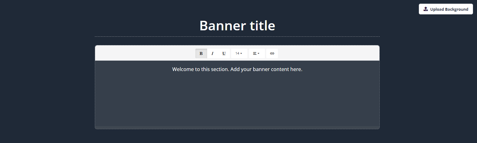
Banner
The Banner block is used to introduce a section, highlight key information, or provide context before learners engage with the content below. Banners are ideal for section overviews, instructions, or important notices.
- Open the Text menu.
- Select Banner.
- A banner will be added to your page with a default title and placeholder text.
Edit the Banner Title
- Click directly into the Banner title text.
- Type your preferred heading for the section.
Edit Banner Content
- Click inside the banner content area.
- Use the inline text editor to format text:
- Bold, italic, underline
- Adjust font size
- Add bullet points or numbered lists
- Insert links
Upload or Change the Background
- Click Upload Background in the top-right corner of the banner.
- Select an image from your computer or media library.
- The image will appear as the banner background.
Tip: Choose high-quality, wide images to ensure text remains clear and readable.
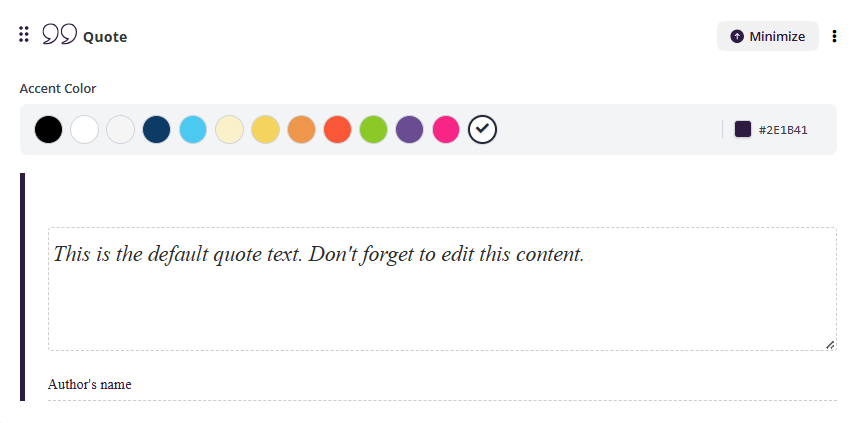
Quote
The Quote block is used to highlight key statements, testimonials, reflections, or important messages. It helps draw attention to meaningful content and visually separates it from the surrounding text.
- Open the Text menu.
- Select Quote.
- A quote block will be added to your page with default placeholder text.
Edit the Quote Text
- Click inside the quote text area.
- Replace the default text with your own quote or highlighted message.
Tip: Keep quotes concise for maximum visual impact.
Add an Author (Optional)
- Click into the Author’s name field below the quote.
- Enter the name of the speaker, author, or source.
Change the Accent Color
- Use the Accent Color palette at the top of the Quote block.
- Select a colour to match your course branding or highlight importance.
- The selected colour will update the vertical accent line beside the quote.
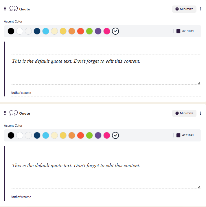
You can also add multiple Quote blocks to the same page, allowing you to emphasise several key insights, learner reflections, or testimonials throughout your content.
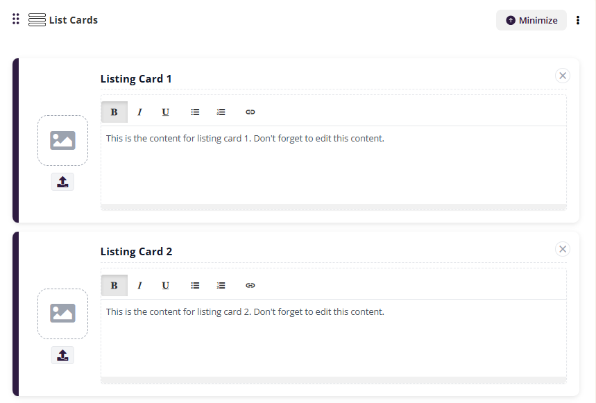
List Cards
List Cards are used to present information in a structured, vertical list format. They are ideal for outlining steps, features, comparisons, or grouped information where each item needs its own space and optional visual support.
Each list card includes an image area and an editable text content section.
- Open the Text menu.
- Select List Cards.
- A set of default list cards will be added to your page.
Edit a List Card
For each list card, you can customise both the image and the content.
Add or change an image
- Click the image placeholder on the left side of the card.
- Upload an image from your computer or select one from your media library.
- Use the X icon to remove the image if required.
Edit the card content
- Click inside the text area of the card.
- Replace the default placeholder text with your own content.
- Use the inline text editor to format text:
- Bold, italic, underline
- Bullet points or numbered lists
- Add links
Tip: Keep each list card focused on a single idea for better readability.
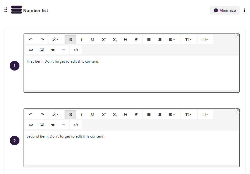
Number List
The Number List block is used to present information in a clear, step-by-step sequence. It’s ideal for procedures, processes, instructions, or any content that needs to be followed in a specific order.
Each item in the list is displayed as a numbered entry with its own rich-text editor.
- Open the Text menu.
- Select Number List.
- A numbered list will be added to your page with default placeholder items.
Edit List Items
- Click inside the text area of a numbered item.
- Replace the default placeholder text with your own content.
- Use the formatting toolbar to customise text:
- Bold, italic, underline
- Subscript and superscript
- Bullet points or sub-lists
- Text alignment and indentation
- Insert links, images, or embedded media
- Use the </> option to add HTML if required
Tip: Keep each numbered item focused on a single step or action for clarity.
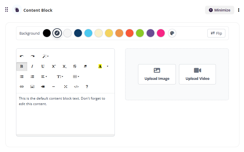
Content Block
The Content Block is a flexible text section used to add structured written content to your course. It’s ideal for explanations, supporting information, instructions, or longer-form text that doesn’t require cards or lists.
- Open the Text menu.
- Select Content Block.
- A content block will be added to your page with editable placeholder text.
Edit Content
- Click inside the content area.
- Replace the placeholder text with your own content.
- Use the formatting toolbar to customise text:
- Headings and paragraph styles
- Bold, italic, underline
- Bullet points and numbered lists
- Text alignment and indentation
- Insert links, images, or embedded media
- Use the </> option to add HTML if required
Add Media and Links
- Use the toolbar icons to insert images, videos, or hyperlinks directly into the content.
- Position media alongside text to support understanding and engagement.
Text Editor
By default, every new activity is created as a Text Editor —a flexible content type that allows you to add rich text, images, and media.
The Text editor uses a standard WYSIWYG interface, similar to a WordPress blog post creator, making it easy to format content visually.

For more advanced customisation, you can click the HTML icon to view and edit the underlying HTML and CSS, giving you full control over the look and feel of your content. If you want to create more notes, click on “Text Editor” to create a new note content. This will be displayed below the previous note.

Customise each course page using the text editor to add text, media, interactions, and assessments. Easily switch between edit and preview modes and choose a one- or two-column layout to suit your content.
Add Multiple Text Editors on the Same Page
You can add multiple Text Editor blocks to a single course page.
If you’d like to create additional notes or content sections:
Click “Text Editor” again within the activity.
A new editor block will be added.
The new content will appear below the previous Text Editor block.

Tip: Break up long pages into smaller HTML sections to improve load times and make editing more manageable.
Add Sources
To include additional resources in your course:
Click on the ‘Add Sources’ section and select how many sources you'd like the system to find.

The system will locate relevant sources, which you can then review and add directly to your course page.

Add & Organise Resources
For Business & Enterprise Accounts only. To upgrade your account go to: https://www.coursebox.ai/pricingResource is an easy to use file management Course built right into the Coursebox Branded Training Platform (Premium) platform - so no need for dropbox or google drive.
With resources, you can:
- Upload files and share with other community members
- Make your files public or private
- Create directories with folders and sub folders
Click on the resources menu on the left-hand side navigation bar to access the resources.

Create a new Folder
Click on + New button to create a new folder.

Type in the name of the folder and select the privacy setting. Click on Save to create a folder.

Note: Resources cannot be rearranged in Coursebox. If you need resources to appear in a specific order, make sure you upload them in the correct sequence, as they will display in the order they are added.
Was this article helpful?
That’s Great!
Thank you for your feedback
Sorry! We couldn't be helpful
Thank you for your feedback
Feedback sent
We appreciate your effort and will try to fix the article